
ggplot で作成したチャート中にテーブルを表示する方法です。
始めにサンプルデータとチャートを作成します。
set.seed(20240619)
library(ggplot2)
library(dplyr)
n <- 10
sampledf <- data.frame(x = seq(n), y = cumsum(rnorm(n)))
g <- sampledf %>% ggplot(mapping = aes(x, y)) +
  geom_line() +
  geom_point() +
  theme_minimal()
sampledf
g
x y
1 1 -1.644206
2 2 -2.696202
3 3 -3.459481
4 4 -4.617875
5 5 -2.801406
6 6 -3.795246
7 7 -3.356669
8 8 -2.259876
9 9 -2.302804
10 10 -1.673276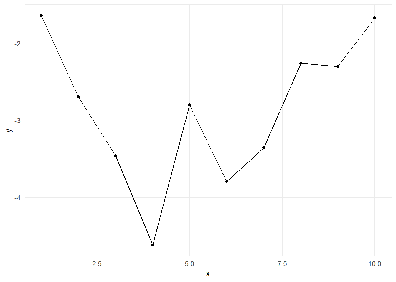
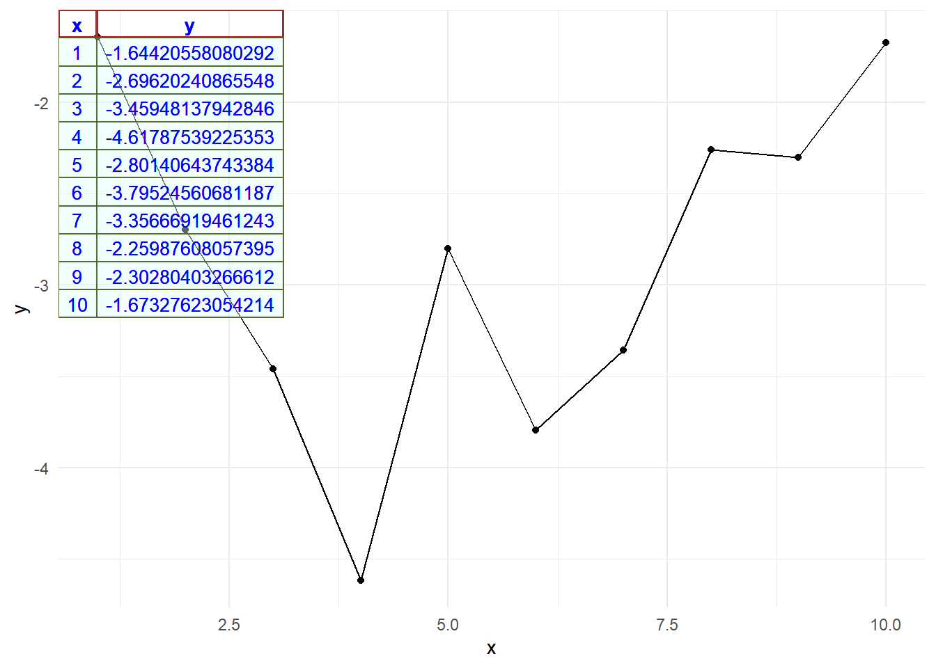
ライブラリ ggpmisc を利用します。
library(ggpmisc)
packageVersion("ggpmisc")
[1] '0.5.6'関数 annotate {ggpp} の引数 geom に table を指定し、x軸方向の位置(x)、y軸方向の位置(y)、表示するテーブル(label)等その他を指定します。
g + ggpp::annotate(
  geom = "table",
  x = -Inf, # テーブルのx軸方向の位置(テーブルの右頂点の位置)
  y = Inf, # テーブルのy軸方向の位置(テーブルの右頂点の位置)
  label = sampledf, # 表示するテーブル(データフレーム)
  angle = 0, # テーブルの表示角度
  table.theme = ttheme_gtdefault(
    base_size = 10, # テーブルのフォントサイズ
    base_family = "Meiryo", # テーブルのフォントファミリー
    base_colour = "blue", # テーブルの文字の色
    colhead = list(bg_params = list(
      fill = rgb(0, 0, 0, alpha = 0), # テーブルのヘッダー(theader)の背景色
      col = "brown", # テーブルのヘッダーの枠線の色
      lwd = 2 # テーブルのヘッダーの枠線の太さ
    )),
    core = list(bg_params = list(
      fill = rgb(224, 255, 255, max = 255, alpha = 40), # テーブル全体(tbody)の背景色
      col = "darkolivegreen", # テーブル全体の枠線の色
      lwd = 1.0 # テーブル全体の枠線の太さ
    ))
  )
)
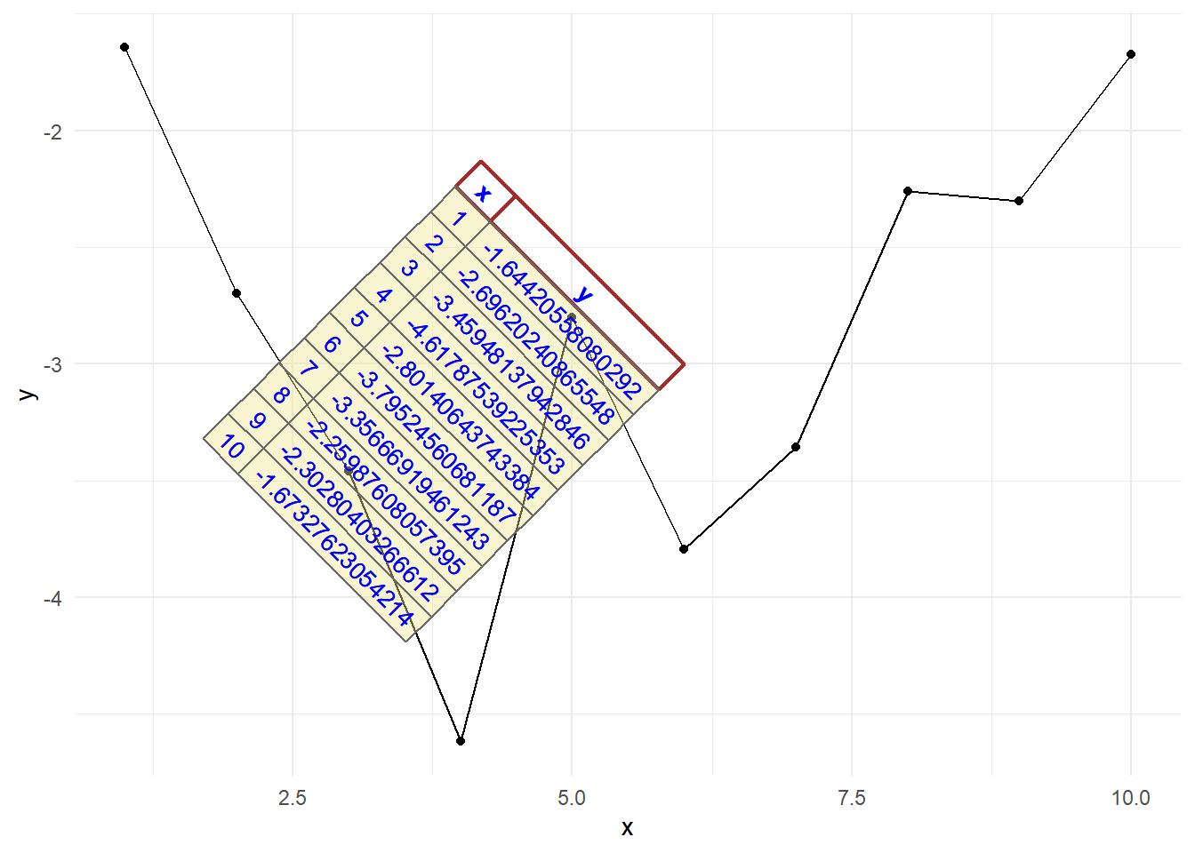
g + ggpp::annotate(
  geom = "table",
  x = round(mean(sampledf$x)),
  y = round(mean(sampledf$y)),
  label = sampledf,
  angle = -45,
  table.theme = ttheme_gtdefault(
    base_size = 10,
    base_family = "Meiryo",
    base_colour = "blue",
    colhead = list(bg_params = list(
      fill = rgb(0, 0, 0, alpha = 0),
      col = "brown",
      lwd = 2
    )),
    core = list(bg_params = list(
      fill = rgb(240, 230, 140, max = 255, alpha = 40),
      col = "dimgray",
      lwd = 1.0
    ))
  )
)
以上です。